Flutter Bottom Navigation Bar


Flutter Bottom Navigation Bar

The Bottom Navigation bar has become popular in the last few years for navigation between different UI. Many developers use bottom navigation because most of the app is available now using this widget for navigation between different screens.

The bottom navigation bar in Flutter can contain multiple items such as text labels, icons, or both. It allows the user to navigate between the top-level views of an app quickly. If we are using a larger screen, it is better to use a side navigation bar.

In Flutter application, we usually set the bottom navigation bar in conjunction with the scaffold widget. Scaffold widget provides a Scaffold.bottomNavigationBar argument to set the bottom navigation bar. It is to note that only adding BottomNavigationBar will not display the navigation items. It is required to set the BottomNavigationItems for Items property that accepts a list of BottomNavigationItems widgets.

Remember the following key points while adding items to the bottom navigation bar:

  • We can display only a small number of widgets in the bottom navigation that can be 2 to 5.
  • It must have at least two bottom navigation items. Otherwise, we will get an error.
  • It is required to have the icon and title properties, and we need to set relevant widgets for them.

Properties of the BottomNavigationBar Widget

The following are the properties used with the bottom navigation bar widget:

items: It defines the list to display within the bottom navigation bar. It uses argument BottomNavigationBarItem that contains sup-properties given below:

  1. const BottomNavigationBarItem({  
  2.     @required this.icon,  
  3.     this.title,  
  4.     Widget activeIcon,  
  5.     this.backgroundColor,  
  6.   })   

currentIndex: It determines the current active bottom navigation bar item on the screen.

onTap: It is called when we tapped one of the items on the screen.

iconSize: It is used to specify the size of all bottom navigation item icons.

fixedColor: It is used to set the color of the selected item. If we have not set a color to the icon or title, it will be shown.

type: It determines the layout and behavior of a bottom navigation bar. It behaves in two different ways that are: fixed and shifting. If it is null, it will use fixed. Otherwise, it will use shifting where we can see an animation when we click a button.

Example:

Let us understand how to create a bottom navigation bar in Flutter application with the help of an example. So, open the android studio and create the Flutter application. Next. Open the main.dart file and remove its code with the below code:

  1. import 'package:flutter/material.dart';  
  2.   
  3. void main() => runApp(MyApp());  
  4.   
  5. /// This Widget is the main application widget.  
  6. class MyApp extends StatelessWidget {  
  7.   @override  
  8.   Widget build(BuildContext context) {  
  9.     return MaterialApp(  
  10.       home: MyNavigationBar (),  
  11.     );  
  12.   }  
  13. }  
  14.   
  15. class MyNavigationBar extends StatefulWidget {  
  16.   MyNavigationBar ({Key key}) : super(key: key);  
  17.   
  18.   @override  
  19.   _MyNavigationBarState createState() => _MyNavigationBarState();  
  20. }  
  21.   
  22. class _MyNavigationBarState extends State<MyNavigationBar > {  
  23.   int _selectedIndex = 0;  
  24.   static const List<Widget> _widgetOptions = <Widget>[  
  25.     Text('Home Page', style: TextStyle(fontSize: 35, fontWeight: FontWeight.bold)),  
  26.     Text('Search Page', style: TextStyle(fontSize: 35, fontWeight: FontWeight.bold)),  
  27.     Text('Profile Page', style: TextStyle(fontSize: 35, fontWeight: FontWeight.bold)),  
  28.   ];  
  29.   
  30.   void _onItemTapped(int index) {  
  31.     setState(() {  
  32.       _selectedIndex = index;  
  33.     });  
  34.   }  
  35.   
  36.   @override  
  37.   Widget build(BuildContext context) {  
  38.     return Scaffold(  
  39.       appBar: AppBar(  
  40.         title: const Text('Flutter BottomNavigationBar Example'),  
  41.           backgroundColor: Colors.green  
  42.       ),  
  43.       body: Center(  
  44.         child: _widgetOptions.elementAt(_selectedIndex),  
  45.       ),  
  46.       bottomNavigationBar: BottomNavigationBar(  
  47.         items: const <BottomNavigationBarItem>[  
  48.           BottomNavigationBarItem(  
  49.             icon: Icon(Icons.home),  
  50.             title: Text('Home'),  
  51.             backgroundColor: Colors.green  
  52.           ),  
  53.           BottomNavigationBarItem(  
  54.             icon: Icon(Icons.search),  
  55.             title: Text('Search'),  
  56.             backgroundColor: Colors.yellow  
  57.           ),  
  58.           BottomNavigationBarItem(  
  59.             icon: Icon(Icons.person),  
  60.             title: Text('Profile'),  
  61.             backgroundColor: Colors.blue,  
  62.           ),  
  63.         ],  
  64.         type: BottomNavigationBarType.shifting,  
  65.         currentIndex: _selectedIndex,  
  66.         selectedItemColor: Colors.black,  
  67.         iconSize: 40,  
  68.         onTap: _onItemTapped,  
  69.         elevation: 5  
  70.       ),  
  71.     );  
  72.   }  
  73. }  

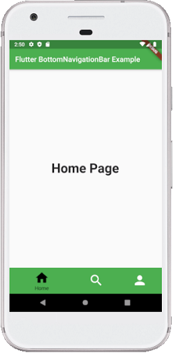
In the above code, we have used the BottomNavigationBar within a scaffold widget. This navigation contains three BottomNavigationBarItem widgets. Here, we have set the currentIndex to 0 that select an item which is in green color. The onTap() function is used to change the selected item's index and then display a corresponding message.

Output:

When we run the app, we should get the UI similar to the below screenshot:

Flutter Bottom Navigation Bar

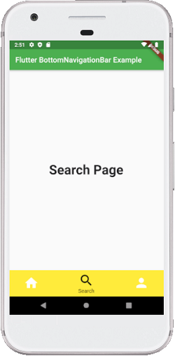
When we click on the search icon in the bottom navigation bar, it will give the below screen.

Flutter Bottom Navigation Bar


Post a Comment

Previous Post Next Post