Flutter Card


Flutter Card

A card is a sheet used to represent the information related to each other, such as an album, a geographical location, contact details, etc. A card in Flutter is in rounded corner shape and has a shadow. We mainly used it to store the content and action of a single object. In this article, we are going to learn how to create a card widget in Flutter. We will also learn how to customize the card widget.

Card creation in Flutter is very simple. We just need to call the card constructor and then pass a widget as child property for displaying the content and action inside the card. See the below code of simple card creation:

  1. return Card(  
  2.     child: Column(  
  3.       mainAxisSize: MainAxisSize.min,  
  4.       children: <Widget>[  
  5.         const ListTile(  
  6.           leading: Icon(Icons.album, size: 45),  
  7.           title: Text('Sonu Nigam'),  
  8.           subtitle: Text('Best of Sonu Nigam Song'),  
  9.         ),  
  10.       ],  
  11.     ),  
  12.   );  

Flutter Card Properties

We can customize the card using the properties. Some of the essential properties are given below:

Attribute NameDescriptions
borderOnForegroundIt is used to paint the border in front of a child. By default, it is true. If it is false, it painted the border behind the child.
colorIt is used to color the card's background.
elevationIt controls the shadow size below the card. The bigger elevation value makes the bigger shadow distance.
marginIt is used to customize the card's outer space.
shapeIt is used to specify the shape of the card.
shadowColorIt is used to paint the shadow of a card.
clipBehaviorIt is used to clip the content of the card.

If we want to customize the card's size, it is required to place it in a Container or SizedBox widget. Here, we can set the card's height and width that can be shown in the below code:

  1. Container(  
  2.     width: 150,  
  3.     height: 150,  
  4.     child: Card(  
  5.        ...  
  6.     ),  
  7.   )  

Let us understand how to use a card widget in Flutter with the help of an example.

Example:

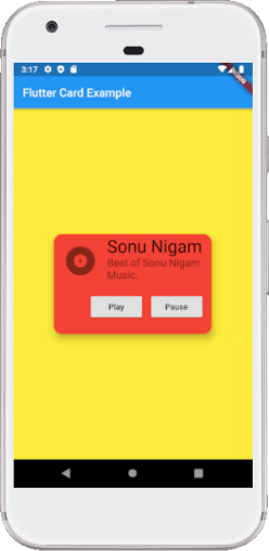
In this example, we will create a card widget that shows the album information and two actions named Play and Pause. Create a project in the IDE, open the main.dart file and replace it with the following code.

  1. import 'package:flutter/material.dart';  
  2.   
  3. void main() => runApp(MyApp());  
  4.   
  5. /// This Widget is the main application widget.  
  6. class MyApp extends StatelessWidget {  
  7.   @override  
  8.   Widget build(BuildContext context) {  
  9.     return MaterialApp(  
  10.       home: Scaffold(  
  11.         appBar: AppBar(title: Text('Flutter Card Example')),  
  12.         backgroundColor: Colors.yellow,  
  13.         body: MyCardWidget(),  
  14.       ),  
  15.     );  
  16.   }  
  17. }  
  18.   
  19. /// This is the stateless widget that the main application instantiates.  
  20. class MyCardWidget extends StatelessWidget {  
  21.   MyCardWidget({Key key}) : super(key: key);  
  22.   
  23.   @override  
  24.   Widget build(BuildContext context) {  
  25.     return Center(  
  26.       child: Container(  
  27.         width: 300,  
  28.         height: 200,  
  29.         padding: new EdgeInsets.all(10.0),  
  30.         child: Card(  
  31.           shape: RoundedRectangleBorder(  
  32.             borderRadius: BorderRadius.circular(15.0),  
  33.           ),  
  34.           color: Colors.red,  
  35.           elevation: 10,  
  36.           child: Column(  
  37.             mainAxisSize: MainAxisSize.min,  
  38.             children: <Widget>[  
  39.               const ListTile(  
  40.                 leading: Icon(Icons.album, size: 60),  
  41.                 title: Text(  
  42.                   'Sonu Nigam',  
  43.                   style: TextStyle(fontSize: 30.0)  
  44.                 ),  
  45.                 subtitle: Text(  
  46.                   'Best of Sonu Nigam Music.',  
  47.                   style: TextStyle(fontSize: 18.0)  
  48.                 ),  
  49.               ),  
  50.               ButtonBar(  
  51.                 children: <Widget>[  
  52.                   RaisedButton(  
  53.                     child: const Text('Play'),  
  54.                     onPressed: () {/* ... */},  
  55.                   ),  
  56.                   RaisedButton(  
  57.                     child: const Text('Pause'),  
  58.                     onPressed: () {/* ... */},  
  59.                   ),  
  60.                 ],  
  61.               ),  
  62.             ],  
  63.           ),  
  64.         ),  
  65.       )  
  66.     );  
  67.   }  
  68. }  

Output:

When we run this app, it will show the UI of the screen as below screenshot.

Flutter Card


Post a Comment

Previous Post Next Post