Flutter Checkbox


A checkbox is a type of input component which holds the Boolean value. It is a GUI element that allows the user to choose multiple options from several selections. Here, a user can answer only in yes or no value. A marked/checked checkbox means yes, and an unmarked/unchecked checkbox means no value. Typically, we can see the checkboxes on the screen as a square box with white space or a tick mark. A label or caption corresponding to each checkbox described the meaning of the checkboxes.

In this article, we are going to learn how to use checkboxes in Flutter. In Flutter, we can have two types of checkboxes: a compact version of the Checkbox named "checkbox" and the "CheckboxListTile" checkbox, which comes with header and subtitle. The detailed descriptions of these checkboxes are given below:

Checkbox:

AttributesDescriptions
valueIt is used whether the checkbox is checked or not.
onChangedIt will be called when the value is changed.
TristateIt is false, by default. Its value can also be true, false, or null.
activeColorIt specified the color of the selected checkbox.
checkColorIt specified the color of the check icon when they are selected.
materialTapTargetSizeIt is used to configure the size of the tap target.

Example:

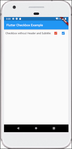
Below is the demo example of checkbox:

  1. Checkbox(  
  2.   value: this.showvalue,   
  3.   onChanged: (bool value) {  
  4.     setState(() {  
  5.       this.showvalue = value;   
  6.     });  
  7.   },  
  8. ),  

Let us write the complete code to see how checkbox is displayed in Flutter. First, create a project in android studio, open the main.dart file, and replace the code given below:

  1. import 'package:flutter/material.dart';  
  2.   
  3. void main() {  
  4.   runApp(MaterialApp( home: MyHomePage(),));  
  5. }  
  6.   
  7. class MyHomePage extends StatefulWidget {  
  8.   @override  
  9.   _HomePageState createState() => _HomePageState();  
  10. }  
  11.   
  12. class _HomePageState extends State<MyHomePage> {  
  13.   bool valuefirst = false;  
  14.   bool valuesecond = false;  
  15.   
  16.   @override  
  17.   Widget build(BuildContext context) {  
  18.     return MaterialApp(  
  19.       home: Scaffold(  
  20.         appBar: AppBar(title: Text('Flutter Checkbox Example'),),  
  21.         body: Container(  
  22.   
  23.             child: Column(  
  24.               children: <Widget>[  
  25.                 Row(  
  26.                   children: <Widget>[  
  27.                     SizedBox(width: 10,),  
  28.                     Text('Checkbox without Header and Subtitle: ',style: TextStyle(fontSize: 17.0), ),  
  29.                     Checkbox(  
  30.                       checkColor: Colors.greenAccent,  
  31.                       activeColor: Colors.red,  
  32.                       value: this.valuefirst,  
  33.                       onChanged: (bool value) {  
  34.                         setState(() {  
  35.                           this.valuefirst = value;  
  36.                         });  
  37.                       },  
  38.                     ),  
  39.                     Checkbox(  
  40.                       value: this.valuesecond,  
  41.                       onChanged: (bool value) {  
  42.                         setState(() {  
  43.                           this.valuesecond = value;  
  44.                         });  
  45.                       },  
  46.                     ),  
  47.                   ],  
  48.                 ),  
  49.               ],  
  50.             )  
  51.         ),  
  52.       ),  
  53.     );  
  54.   }  
  55. }  

Output

Now execute the app in the emulator or device, we will see the below screen:
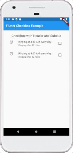
Flutter Checkbox

CheckboxListTitle:

AttributesDescriptions
valueIt is used whether the checkbox is checked or not.
onChangedIt will be called when the value is changed.
titileIt specified the main title of the list.
subtitleIt specified the subtitle of the list. Usually, it is used to add the description.
activeColorIt specified the color of the selected checkbox.
selectedBy default, it is false. It highlights the text after selection.
secondaryIt is the widget, which is displayed in front of the checkbox.

Example:

Below is the demo example of CheckboxListTitle:

  1. CheckboxListTile(  
  2.   secondary: const Icon(Icons.abc),  
  3.   title: const Text('demo mode'),  
  4.      subtitle: Text('sub demo mode'),  
  5.   value: this.subvalue,   
  6.   onChanged: (bool value) {  
  7.     setState(() {  
  8.       this.subvalue = value;   
  9.     });  
  10.   },  
  11. ),  

Let us write the complete code to see how CheckboxListTitle is displayed in Flutter. First, create a project in android studio, open the main.dart file, and replace the code given below:

  1. import 'package:flutter/material.dart';  
  2.   
  3. void main() {  
  4.   runApp(MaterialApp( home: MyHomePage(),));  
  5. }  
  6.   
  7. class MyHomePage extends StatefulWidget {  
  8.   @override  
  9.   _HomePageState createState() => _HomePageState();  
  10. }  
  11.   
  12. class _HomePageState extends State<MyHomePage> {  
  13.   bool valuefirst = false;  
  14.   bool valuesecond = false;  
  15.   
  16.   @override  
  17.   Widget build(BuildContext context) {  
  18.     return MaterialApp(  
  19.       home: Scaffold(  
  20.         appBar: AppBar(title: Text('Flutter Checkbox Example'),),  
  21.         body: Container(  
  22.             padding: new EdgeInsets.all(22.0),  
  23.             child: Column(  
  24.               children: <Widget>[  
  25.                 SizedBox(width: 10,),  
  26.                 Text('Checkbox with Header and Subtitle',style: TextStyle(fontSize: 20.0), ),  
  27.                 CheckboxListTile(  
  28.                   secondary: const Icon(Icons.alarm),  
  29.                   title: const Text('Ringing at 4:30 AM every day'),  
  30.                   subtitle: Text('Ringing after 12 hours'),  
  31.                   value: this.valuefirst,  
  32.                   onChanged: (bool value) {  
  33.                     setState(() {  
  34.                       this.valuefirst = value;  
  35.                     });  
  36.                   },  
  37.                 ),  
  38.                 CheckboxListTile(  
  39.                   controlAffinity: ListTileControlAffinity.trailing,  
  40.                   secondary: const Icon(Icons.alarm),  
  41.                   title: const Text('Ringing at 5:00 AM every day'),  
  42.                   subtitle: Text('Ringing after 12 hours'),  
  43.                   value: this.valuesecond,  
  44.                   onChanged: (bool value) {  
  45.                     setState(() {  
  46.                       this.valuesecond = value;  
  47.                     });  
  48.                   },  
  49.                 ),  
  50.               ],  
  51.             )  
  52.         ),  
  53.       ),  
  54.     );  
  55.   }  
  56. }  

Output

Now execute the app in the emulator or device, we will get the following screen:

Flutter Checkbox


Post a Comment

Previous Post Next Post